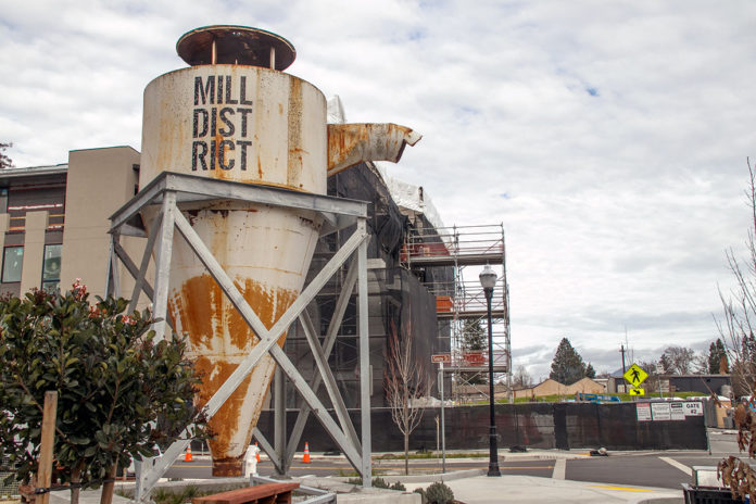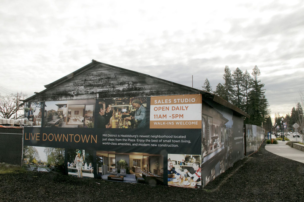
The promises of “small-town living” and “world-class amenities … just steps from the Plaza” are being promoted at Healdsburg’s newest neighborhood, the Mill District.
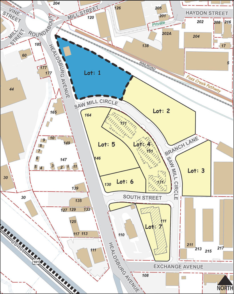
That’s what the signage says, at least, on the wood-and-tin shack at Mill Street and Healdsburg Avenue, the northwest corner of the 9.6-acre development at the former Nu Forest Products, the site of the proposed hotel.
“Luxury Residences Now Selling” include the 1-, 2- and 3-bedroom “Canopy” condos and penthouses, with prices listed from $1 million to $8.5 million. The company website at milldistricthealdsburg.com lists the three-bedroom flats as sold out, and the website says all units are “more than 60% sold.”
The 43 condominiums at Canopy are designed by architects Olson Kundig, based in Seattle. The units are still under construction although the developer, Replay Destinations, optimistically projects that “closings” are possible this spring.
Hotel Workshop
But it hasn’t been all smooth spackling for the Mill District. Last week, on Jan. 9, Replay presented a vision of a major component of the development, a 53-key hotel, to the city’s Planning Commission for review.
Since the meeting was officially a “workshop,” no votes were taken or decisions were made. But the commissioners’ response to the design proposal was lukewarm at best.
Anchoring Lot 1, the most visible of the Mill District’s corners, will be a four-story, 53-key hotel at 192 Saw Mill Circle, with restaurant, bar, outdoor pool, spa, fitness center and parking, and a separate, one-story commercial building. Currently named the Mill District Hotel, it will be somewhat larger than the 30- to 40-room hotel initially proposed, but at some point the “key number” was set at 53.
As with Piazza’s H4 hotel at 400 Healdsburg Ave., the number of “keys” does not necessarily reflect the number of rooms or beds, and 12 two-bedroom units are foreseen, for a total of 77 bedrooms.

Replay’s vice president of development, Mike McCone—who stepped into the job as project leader for the Mill District only five months ago—introduced the developer’s presentation by saying that following initial design presentations to the city in 2019, it was decided that “below-grade parking” was financially impractical, and the “amenities” building initially proposed for Lot 1 would better be located on a neighboring section of the overall property. Thus, there were changes in the design being presented now.
Architect Tom Sprinkle talked about some of the historic uses of the site and its functional architecture as a lumber mill, including archival photos of the mill and its operation. Saying that the “historic urban fabric on this site was developed over time,” Sprinkle called his research “discovering the emotional history” of the site, which might be reflected in the functional if not industrial elements in the current design.
But Planning Commissioner Vesna Breznikar jumped in to express skepticism of this approach. “You’re not suggesting that this is architecture, these are functional buildings. To create a whole new building based on these is I think not a good solution.” she said.
“We never saw this [lumberyard]; it was behind fences, it wasn’t part of our history,” Breznikar continued.
Sprinkle responded, “Well I think (for) the people who worked there, it was part of their history, for sure.”
He doubled down, citing “vertical elements harkening back to industrial elements that were on the site before” to explain his design choices.
Landscape Perspective
Landscape architect Don Vita then focused on low water-use vegetation, seasonal color palettes and the use of local plants and oaks, the “iconic tree” so prevalent in Northern California. A redwood grove is also being preserved on the larger site for inclusion in a .76-square-mile park in the middle of development.
Following the architecture and landscape presentations, Luks called for broad overview comments from both commissioners and the public. Many immediately took issue with the overall design choices of the hotel proposal, unleashing an hour of complaint that appeared to take Replay by surprise.

The uninspired treatment of the “iconic corner” of Healdsburg and Mill Street, the narrow end of the triangular shaped Lot 1, drew particular disapproval. Commissioner Stephen Barber objected to the corner treatment as presenting little more than “the blunt end of the hotel building,” its primary function being the back-of-the-house facilities that go with hotel operations.
Breznikar expressed dismay that the corner showed little if any inspiration, saying she had hoped for a Flatiron Building treatment to provide visual interest if not a unique identity.
Vice Chair Conor McKay was appreciative of the rough design presented for the restaurant, with its evident Japanese aesthetic, but on the whole was also disappointed by the “box-on-box” design of the hotel building.
Treehouse Envy
One particular aspect of the hotel that drew disapproval were the balconies attached to the north side of the hotel, which had the appearance of being literally stuck on to the building’s face like an afterthought. Architect Sprinkle had called attention to these balconies by saying they evoked for him the treehouses he had built in his childhood, but their personal appeal was lost on the larger commission.
Two architects in the audience at the workshop offered their appraisals. Jonathan Pearlman of Healdsburg’s Elevation Architects echoed Barber’s objections. “The hotel block looks like an office building … a missed opportunity,” and compared it to a Holiday Inn or Motel 6. (Chair Lux chimed in that it looked like a Hampton Inn to him.)
Pearlman also said he counted “five different architectural vocabularies here,” but said that they were unconnected. “None of them relate to each other, I think that’s missing a huge opportunity.”
Kenneth Munson, a Sonoma County architect for 30 years, referred positively to the initial renderings for the hotel site dating back to 2019, but said those ideas had been “eroded” over time. “These different things that are going up now, like the Canopy stuff, those are office buildings,” he said.
Commissioner Luks made the observation that other Replay Destinations projects, as at Whistle and the Lift Hotel in Park City Utah, were more what he was hoping to see. “I hope we could get some inspiration from what these guys have already built,” he said.
Replay Response
Following an hour of critical comment from commissioners and citizens alike, Luks asked if Replay had a general response. After a few stunned moments, McCone said, “‘We’re not ready to respond, except that we embrace the process and embrace all the thoughtful comments.”
Following the meeting, Planning Director Scott Duiven summarized the workshop’s findings, citing “three clear take-aways: (1) The project design should do a better job of addressing the round-about both in terms of creating an architectural statement at that important gateway to the downtown, and in terms of facilitating pedestrian flow into and through the project site; (2) the massing and design features of the main hotel building should be modified to reduce its boxiness; and (3) the architectural elements throughout the project should be tied together in a more coherent way.”
Replay next comes before the Planning Commission on Feb. 6, to present its plans for the Auxiliary building on Lot 2. It was advised to have a more developed response to the January workshop at that time.
The entire 9.6-acre Mill District complex, projected to include over 200 residences as well as restaurants, retail shops and the hotel, is expected to be finished by 2028—optimistically, about the time that the SMART train will finally arrive in Healdsburg.


A good article my Christian Kallen. My wife and I live in our home on Fitch Street about 1/4 north of the Mill District Project. We know Ken Munson from the old days. We also miss the old mill and old Healdsburg. But those days are gone and they aren’t coming back.
Replay can build whatever it wants. Who cares what color it is or whatever? The damage to our town is done. Paint it all pink. I don’t care.
Very happy to see this meeting covered by the paper. I was one of the townspeople who showed up to complain that the recent renderings of the proposed Hotel that were recently submitted by developer Replay did not in any way reflect the tasteful and somewhat rustic design they had presented in their renderings produced in 2019. The latest design places a huge looming four story box on this important entrance to town that the local architects in the audience compared to a Holiday Inn, Motel 6 or Hampton Inn. I thought it looked like something you would see next to the road on route 5. One thing not mentioned in the article was that it seemed like the Planning Commision was just as surprised as the rest of us at the horrible design presented and it appeared this was the first they had seen of it just like the rest of us. Also the architect’s talk on his thought processes and how his work celebrated the history and charm of our town (with slides) seemed like a joke from the satirical film Waiting For Guffman as he went on and on about the rustic sawmill and our small-town country heritage while then presenting a giant soulless box with some ugly balcony’s stuck on it and a four story windowless wall partially facing the roundabout. Hopefully our intelligent planning commission can get them to institute needed changes to make this giant eyesore more appealing, but the bottom line is it appears, as usual, another outside investment group is exploiting us again and we won’t be getting anything like the beautiful more human sized development that Replay presented to us to sell their investment to us country rubes. We will be getting an oversized generic big box hotel plunked down at the entrance to downtown, out of scale and if not changed significantly, without any artistic flair or architectural interest to set it apart from any other run of the mill budget motel you see everyday. Sad.
FYI, I updated the section of this article in which Vesna Breznikar appeared skeptical of the architect’s use of the old lumberyard architecture. The point remains the same, but his response is included.
Christian Kallen is a very good writer. I enjoy all of his articles in the Spittoon. Thank you.